Welcome to an insightful discussion on the recent redesign of Google Maps, where we delve into the enhanced user interface and functionality changes. The latest updates aim to elevate the navigation experience for users worldwide, making exploring locations smoother and more intuitive. Stay tuned as we explore the Google Maps redesign features that promise to revolutionize your mapping journey.

Redesigned UI
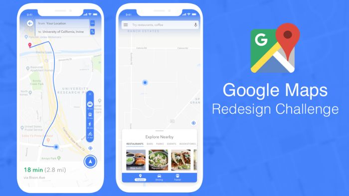
Google Maps’ redesign features a user-centric approach, elevating the map as the central element in the navigation interface. Full-screen panels have transitioned to sleek, transparent windows, allowing simultaneous map viewing and destination exploration. The refined design showcases simplified windows with rounded corners and intuitive buttons for enhanced usability.
Moreover, the updated UI introduces floating markers for origin and destination points, offering a visually streamlined navigation experience. Transportation mode selection now resides at the bottom of the screen, accentuating the map’s significance in route planning. Notably, this UI overhaul will seamlessly deploy through server-side updates, indicating a forthcoming widespread implementation following successful testing phases.
As Google Maps’ redesign progresses, users anticipate a more intuitive and immersive navigation experience. The forthcoming potential extension of similar visual updates to the iOS platform hints at a unified and cohesive design language across various devices, promising a consistent and user-friendly interface for all Google Maps users.